
Back to the ‘In Limbo’ series: Sepia I*
A very different approach.
A combination of Watercolor, Indian ink and Acrylic [a lot of it!]!
A beautiful weekend to everyone.
*yes, there is a Sepia II!
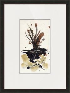
In Limbo – Sepia I

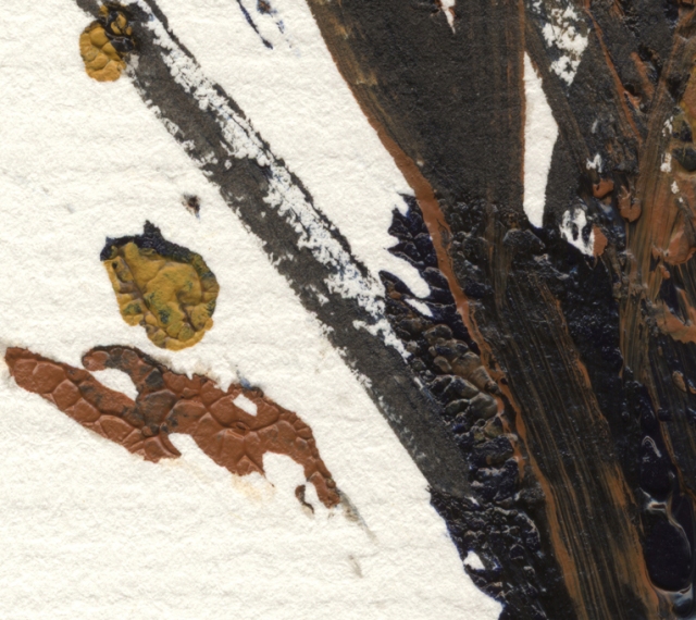
detail 1
detail 2

detail 3
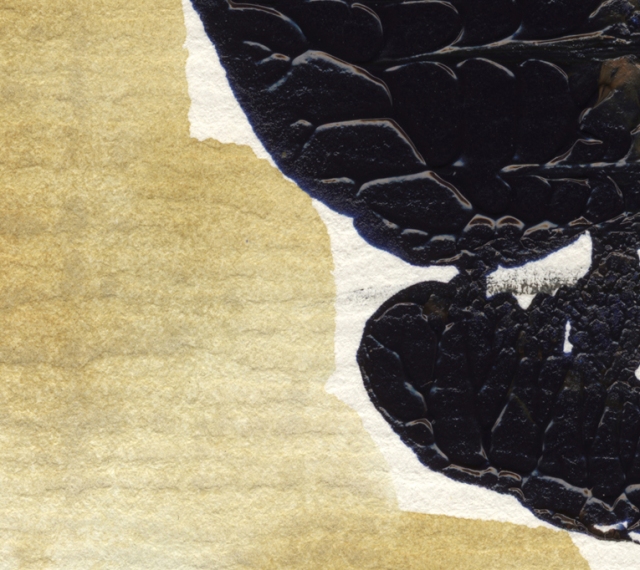
Technique: Acrylic, Indian Ink, Watercolour [mixed media]
Original size: 14x25cm
from my watercolor, ink & acrylic series “In Limbo” 2014 © Marina Kanavaki
SHOP In Limbo – Sepia I ART PRINT @ Imagekind
[museum quality printing and framing]

SHOP In Limbo – Sepia I ART PRINT @ Society6

Visit my shop for art prints, framed or on canvas or printed on iphone cases, laptop skins, cards, mugs, t-shirts, tank tops, v-neck tees, biker tanks, hoodies, tote bags, shower curtains, pillows, duvet covers & much more at Society6
If you wish to know more about the painting [concept, price & availability] or if you see something you like that has sold, I am happy to paint something similar as a commission, please get in touch at anmar.graphic.art@gmail.com
•
My paintings are also available on art prints – framed or on canvas at Imagekind and specially designed on various everyday products at Society6[US] / Society6[Europe]
Categories: BuyM, Dreamscapes, In Limbo, RentM, Trees & Forests, UseM


Wonder how I missed this beautiful painting! 😯 Love the colours stately and dignified!
Kind regards dear Marina.
This is so different of your works dear Marina!
It’s amazing ❤️
xxx
As always, I like the colors the best. Their balance.
That’s great to hear, Stephen! Thank you, my friend. Have a beautiful weekend ahead. 🙂
Love it dear Marina! Love details and feel energy in this painting❤️❤️❤️
xxx
So happy to hear that, Violet! Thank you, my dear! Greetings to Malus! xx 🙂
M, I really love the splatter in the second one. It’s
perfect.
=)
Ah, thank you, D!!! Have a wonderful weekend! 🙂 xx
Reporter: I’m approaching a man who’s lying on the ground. He appears stunned. He’s pointing at In Limbo – Sepia I, by world-famous artist and Mt. Olympus resident Marina Kanavaki. His eyes are glazed. He’s making strange noises. He’s foaming at the mouth. Either that, or he’s been eating whipped cream. Good heavens! it’s famous illustrator Mark Armstrong!!
“Mr. Armstrong, would you care to comment on Ms. Kanavaki’s painting? Does she show promise as an artist? Does this work speak to you? What do you think of the color scheme? She seems to have used a lot of sepia– do you think that’s just a coincidence?? Say something, Mr. Armstrong! Could you sum up this Limbo Sepia Thing for us in just one word??”
“G-G-G-G-Genius!!” (klunk!)
“Well, he’s passed out with a look of ecstasy on his face. Nothing to worry about, I understand this happens a lot when he’s viewing Ms. Kanavaki’s work. Let’s get back to the studio now and the latest Mt. Olympus weather report, with meteorologist Zeus Smith… “
……………………………………………………. ……. ………………. …… ……….. …… …. ….. .. ……………………….. . . . . . klunk! Klunkety klunk…. the marina kanavaki is trying to recover from they joy of reading your ‘comment’ and well, guess which was the word she uttered: ‘G-G-G-G-G-G-G-G-Genius’ and thought to herself, ‘how lucky am I to have the honor of Mr. Armstrong’s friendship’! 🙂
Love the combination of mediums Marina… I am enjoying my acrylic’s at the moment… 🙂 xxx
I know you are and your acrylics look very happy too!!! 🙂 xxxx
Thank you… They make me smile! 😉 xxx
Marina, you take me to a strange and intimate place, both tender and dangerous. i hear compositional echoes of figures on Greek vases. beautiful and daring. x tony
Tony, I am overjoyed by your kind words! ‘beautiful and daring’ …what a combination! Thank you so much, my friend! 🙂
What fun! It’s always fun to try new media. I’m going to try it. I’ve been using walnut ink. It’s a lovely color brown. Hummm I could throw in a little acrylic ………
Yes, you could!!!!! It sure is fun!!! 🙂
Absolutely fantastic, Marina! Apart from appreciating the components of the artistry, it’s the wonderful energy of this piece that is most compelling for me.
Oh, so good to hear that, Elena! It means a lot! 🙂
Beautiful, love the texture and lines of the painting, glad you are trying new things.
Thank you, my dear Doris!! 🙂
Drop dead gorgeous work. I can almost see the focus of thought and the hands and fingers at work.
Ten **********
Oh, and ten ‘thank you’s’ to you, John – very much so! 🙂
Marina, if you can believe it once again your post didn’t show up in my Reader, so I’ve un-followed and re-followed, but also signed up for email notification.
Wow what brilliant creativity, – this is a fascinating piece. The thickness of acrylics gave an incredible play on textures as well as the brush strokes, and then the subtleties of color changes makes for powerful piece of art.
Oh, Mary, what a wonderful thing to say! Thank you so much, my dear and thanks for going through the trouble of re following/ re subscribing!! 🙂 xx Loved your serene boat! today!!
Wow! I love it! Will you create more like this? (I hope!) ~xo
🙂 NoII is waiting in line for this week!!! So glad you like it, my dear friend!!! Happy Wednesday! I’m going to be thinking of your dawn over the Atlantic!! xxxxx [http://pwilsondesign.wordpress.com/2014/09/02/coastal-living-in-september/]
This is one of my favorite ones, Marina… Very “organic”. I love the colors and textures.
Best wishes, Aquileana 🙂
I like ‘organic’!!! …and i am in an ‘organic’ mood too!!! Thank you, my dear Aquileana! Best wishes to you too!! 🙂 xx
Reblogged this on By the Mighty Mumford and commented:
DON’T YPOU LOVE IT HOW ARTISTS CAN DO A FEW BRUSH STROKES, A FEW PRECISE PALETTE KNIFE SCRAPINGS AND SOME PAINT TEXTURING AND PRODUCE A PLANT WORTHY OF STUDY!!!
Fabulous.
🙂
Ah, thank you!!! 🙂 🙂
How wonderful…
Have a great Monday Marina 🙂
Andro xxx
Thank you so much, my friend. Hope you are well. Have a great new week, month and …Monday! 🙂
Thank you for your kind wishes Marina
and I hope that your Friday and weekend
are absolutely excellent my sweet friend 🙂
Andro xxx
…and your too, my dear Andro!!! Best wishes! 🙂
The tactile textures are gorgeous Marina. And I love the chocolaty colour palette as well 🙂
I’m so happy to hear that, Madhu. Thank you, my dear. Have a beautiful September [and Monday and new week!]!! 🙂
Very beautiful! ❤
Thank you very much!! 🙂
These are wonderful, earthy and appealing to that sense of peacefulness we all need in our world.
We do indeed!!! That’s a beautiful thing to say, Valentine. Thank you so much!!! 🙂
As much as I love vibrant colors, Marina, I also love these earth tones, too. They remind me of the season to come. Wonderful texture detail, also! Have a lovely, long weekend, my friend! ♥
…and what a beautiful season it is too!!! Thank you, my dear Lauren and a wonderful new week ahead to you!!! 🙂 xx
This beautiful like an exquisite vase. Another soul-stirring piece Marina 🙂
‘soul-stirring’!!! what more could I ask for?!!! Thank you, Ken! 🙂
I love it – a distillation of exuberance – beautifully realised. Have a great weekend, Marina!
What a comment! Thank you so much, Richard!! 🙂 Yout too, my friend! 🙂
I thought you used a snack skin but was sure you would not.. Like the texture very much 🙂
😆 😆 I could have! I use whatever comes in handy!! 😉
This is thick luscious pigment straight from the tube! 😉 Thank you, my dear friend! 🙂
🙂 😉 :-0 xx
Woo! Love it! Especially detail two… Amazing you are
Thank you, my dear Pink! You are so sweet! 🙂
You are the sweetest! Your creations remind us to keep thinking of new solutions to what life feeds us.. turn it into art! 😀
Wow! Gorgeous, Marina!
Awwwww, thank you, Resa!!!! :- xx
xx
Loved the sepia tones, Marina! Great work, as always. 🙂
Thank you, my dear Nandini!! 🙂 Happy weekend! 🙂
A touch of fall in this very different artwork, Marina. I like the effect of the different mediums. There’s lots of texture and bold strokes evoking a feeling of strength. Powerful artwork ..!!! 😃
Oh, thank you, Isadora! I do get carried away with acrylics. I’m more ‘direct’ and I enjoy it! Yes, a touch of fall. The beautiful season! 🙂 Happy weekend, my dear! 🙂
I find a certain sadness and explosion of rage, exasperated by what you can not change… going into autumn.
The other side of reality that we share… (I told “clinock” that I associate this painting to the Bach’s cello suite No.5 in C minor)
Very inspiring, dear ❤ kisses :-)claudine
Autumn is probably my favorite season as it leads us to a more introverted season [winter] softly and with such a blast of color [the last one before the white season]. There is something bitter sweet in that and I love it. Thank you so much, my dear Claudine for your insightful words! 🙂 hugs and xxxxxx
I like the texture in this one, and the subtle tones. Lovely, Marina!
So nice to hear!! Thank you, Amy! Happy weekend, my dear! 🙂
Such chocolaty, earthy and rusty beauty Marina…I feel the colours and textures deep in my gut. There’s a cello playing here, a baritone sax, a heralding of autumn, bitter sweet…
I had the same impression: a cello playing… on the notes of Bach’s 5th. suite…
Awwww…. thank you, my dear Claudine! I suppose it wouldn’t come as a surprise if I told you that I usually am listening to Bach when painting! 😉 xx
….ah, ‘…a heralding of autumn’, true and right now I am looking forward to this season, Spring in reverse! Thank you, my dear friend. Now you got me thinking of a musical piece for cello and sax! 😉
What an amazing combo that would be…!
Hi Marina,exquisite creation of shades and colors,l see in the painting ,fire work,a ship with sailing ,l can see a vase with unique flowers.the black colors adds new dimensions to the work.Regards.jalal
Ah, Jalal, all these beautiful visions! Thank you so much. Regards and wishes for a wonderful weekend! 🙂
This is a wonderful piece of art Marina…have a great weekend …:-)
Thank you, my dear Sriram! You too enjoy a wonderful weekend! 🙂
Yes, the textures are interesting and impressive. Colors a bit grim, but always “as above so below” reflections.
Very observant!!! Yes, they are… after all these two themes are very much intertwined. Thank you, Stephen. Happy weekend!!! 🙂
I like it, but browns and blacks aren’t my favorite color combos. Interesting appearance of texture, something I haven’t noticed in your work before …. so well done!
Ah, thank you, Frank! When I use acrylics it’s hard for me not to succumb to thick layers! Happy weekend, my friend! 🙂
They make me think of snow melting from the landscape. Very different and lovely.
Oh, I like that! Thank you, my dear Gilly! 🙂 Have a great weekend! 🙂
Detail two is telling me more its you. Special , concrete or a revealed abstract. a nice thin layer.
Ah, Bart, thank you so much! 🙂 Have a beautiful weekend.
Stunning artwork, Marina. Love it. 🙂
Thank you, my dear Sylvia! Have a great weekend!! 🙂 xx
Nice textures (the paper works well with the paint texture and smooshes)
I’ve always loved textures and I’ve missed them after a long watercolor period, so it was fun doing this! Thank you!! 🙂
Oh, Marina, this is so different than what you usually do. I love it!….great work!
xxx
Ah, glad you like it, Deb!!! Happy weekend, my dear!! 🙂 xxxx
One extraordinary beautiful surprise after another. Great work!
What a compliment! Thank you, my dear Jean-Jacques! 🙂