
detail 1
detail 2

detail 3

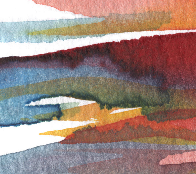
Atom Sea #21
Technique: watercolour
Original size: 18x18cm
from Marina Kanavaki watercolor series “Atom Sea” © 2013
Categories: art, Holidays, Watercolours
detail 1
detail 2
detail 3
Atom Sea #21
Technique: watercolour
Original size: 18x18cm
from Marina Kanavaki watercolor series “Atom Sea” © 2013
Categories: art, Holidays, Watercolours


![Johannes Brahms, Edvard Grieg, Henriëtte Bossmans, Abbey Lincoln, Anita O’Day, Ella Fitzgerald, Mel Bonis, Gabriel Pierné & Dino Saluzzi [reblogs]](https://i0.wp.com/marinakanavaki.com/wp-content/uploads/2026/07/july2-reblogs.jpg?resize=200%2C200&ssl=1)
![Opal Ten [aka October!]](https://i0.wp.com/marinakanavaki.com/wp-content/uploads/2017/10/octobder-full-moon-2017-featured.jpg?fit=1200%2C668&ssl=1&resize=200%2C200)


Lovely, Marina. Your details are like mini works of art embedded in larger works of art!! : )
Ah, Mark, what a description… Thank you!!!
🙂
Mercy, mercy.
Every time I visit here, I see colour removed of labour. That is, you lay it down and art follows as its nature demands.
There seems to be no labour to what you produce (forgive me), only inspired art, beauty, originality.
Sigh… to be YOU! 🙂 I really, really love those colours, the pastel of it – but more than that, it’s how you lay it out. Just beautiful, Marina.
Noeleen, if I ever wanted to compliment an artist, I doubt if I’d find better words to express it!!! Your presence here makes me very happy! Thank you so much!
🙂
Watercolors do require a certain amount of controlled timeing & you do have colorific control, most apparently…
Oh, thank you, Lindy! Yes, they are quite adventurous those colors! But it’s fun working with them!
🙂
hello Marina, thanks for following. I love your watercolours, I like the way you control the medium, so easy to let watercolour be the boss.
tony
anthony-farmer.blogspot.com (charabanc)
So very true! Watercolor does tend to be bossy, but then …it doesn’t know with what stubborn handler it’s dealing with!! 😆
Thank you very much, Tony!
I was glad Gilly introduced you!
🙂
Thank you for following me , I truly lovely your art.
You are very welcome, Willow! My pleasure. Thank you for your kind comment!
🙂
😉
Another masterpiece Marina 🙂
Ah, thank you Jake!!
🙂
Happy Easter! full of love happiness and money you want -your maxima
Thank you, Stefan [ours is a month away] and Happy Easter to you too!
🙂
Kinda describes me some days…. roiling on top but calm below…. ah!
That’s the perfect combination, Rumpy! Calm below means strong character!
🙂
Marina, you never never cease to amaze me with what beauty you construct from somewhere within. Just lovely – again.
…like you do too, my dear Noeleen! Thank you!
🙂
Lovely job, as always, Marina – really a pleasure to view the details!
Thank you very much, Anne. I’m glad you like it!
It’s very nice seeing you here!
🙂
Marina, a special thank you! http://decamvilledesign.wordpress.com/2013/03/28/introducing-my-new-spring-textile-collection/
Wow! Your textile collection is amazing, Patricia!!!
Bravo, my friend!!!!
…and thank YOU for the inspiration!
🙂
Thank you, Marina! I’m so glad you like it! It was fun to make! 🙂
lovely flow of colors…today is the festival of colors in India !!..:-)
Thank you and Happy Holi, dear Sriram!!
🙂
🙂
Oh, Marina, that is just beautiful!
Sunrise or sunset…either way it’s splendid and rejuvenating! 🙂
I’m so happy you find it rejuvenating!! Thank you and happy Thursday my dear!
🙂
Beautiful blending of colors, Marina.
Thank you, Donna! Happy Wednesday evening! 🙂
I love the flow and colors of your design. Reminds me of summer and going to the snow cone shop having a taste of many flavors of syrup over ice cone.
BE ENCOURAGED! BE BLESSED!
Yum yum!!!
Thank you very much, Francine!!!
🙂
Very pretty, but I wait the app 😉
Good morning Marina
…soon!
Good morning and good day, to you!
🙂
some sunrise impressions!
Glad you like it, Frizz!!!
🙂
Love the colors, but I think your use of white is what makes this one. By the way … it reminds me of water flowing away from me.
“away” huh?! Now, that’s a beautiful image…
It is the white that “bleaches” the waters isn’t it?!
Thank you, Frank.
🙂
Brilliant Marina!
Love colors! So fresh and warm❤
Thank you so much, my dear Violet!!!
🙂 xx
Love them Marina – so vibrant!
Thanks, Jim! Very happy to hear that!!!
🙂
Very pretty layers and blends of colours. I like these very much. The bottom image reminds me of gulls flying in a colourful sky!
Oh, thank you, Meanderer …”gulls flying in a colourful sky” sounds so nice!!!
🙂
Wow, you are amazing with watercolors. Once upon a time, a long long time ago, I also tried to paint with watercolors. It didn’t work…..it looked like a painting from a baby ;-(
I’m sure you are exaggerating, Ilse! 🙂
Thank you very much, my dear …and maybe it’s time you gave it a try again?!
🙂
The colors are gorgeous! Today we celebrate the festival of colors in India – Happy Holi 🙂
Happy Holi, dear Dilip! A truly wonderful festival! 🙂
Thank you very much!
Namaste!
These are quite a departure from the sketches you’ve been showing us. Very lovely work.
Ah, thank you, Ronnie!
🙂
I love the way you have done close up on your painting … stunning – the art in itself is fantastic. Stunning with the blue, yellow … with the red.
Thank you so much, my dear Viveka!!! I’m very happy you like it!
🙂 xxxx
Always a pleasure … glad I didn’t order a sleeve for my netbook, because it’s not working properly anymore.
Happy Easter to you, Marina.
Brilliant series of detail edits Marina. Beautiful. Your work always amazes me. And the fact that you can take a larger work and edit it down to several smaller interesting successful abstracts shows the overall talent for quality work that you exhibit.
I’m so glad you like this, Terry! Means a lot and I am very very flattered my friend!
🙂
Beautiful! The crimson/gold tones on the vivid blue are so dramatic.
Thank you, my dear Madhu. I’m very happy to hear that!!
🙂
What I find interesting in the close ups is that the smaller the scale, the more you see the result of uncontrolled random processes, like the paint being sucked into the paper by capillary forces, while the designed component is reducing. On the large scale, on the other hand, the design is dominating. In between there is a scale dominated by your style, that is the way you have learned to see and move “automatically”, still your action but not planned. So there is a conscious component, an unconscious component and a physical component, each dominating their respective scale.
Very wise remark! I do see what you’re saying and it’s quite intriguing! I find it very interesting to enlarge my work, after it’s done. I see so many things captured…
Thank you so much for this insightful comment!
I think the role of scale in aesthetics and the different structure-forming processes on different scales are something I have to write an article about. I’ll have to think about it. Thanks for the inspiration.
I’d be very interested to read about it, Andreas. Thank you!!
🙂
This comment was the “seed” of my recent article on Aesthetics of Scale.
…and an excellent article on the subject, it is too!!!
🙂
Thank you!
These colors are gorgeous, Marina. The look of rippling water…makes me think of a summer day at the beach.
Have a great day and evening, my friend!
xxx
Oh, Deb, it is exactly that and I’m so glad you like it! A summer sunset “rippling” the water. Thank you, my dear and you too have a great day and Tuesday evening. xxxxxxx
Oh, Marina, these colors are so gorgeous! I am speechless and so very moved by this piece! It’s a most beautiful color palette, and the way they blend into each other, it’s just stunning! I can’t stop staring!!! ~xoxoxo!!!
Aw, that is so nice to hear, especially from you, my dear! I had a feeling you would like the colors… now I’m even happier!!!! Thank you, my friend! 🙂
Wonderful!!!!!
Dear Marina!
These colors is beautyfull!!!!!
One kiss for you sweet Artist Woman
Claude
Thank you very much, Claude. As always, flattered!!
🙂
Great use of wash and layering. Your details could be paintings all by themselves. The first could be land and sky. Detail one always makes me wonder how you can get such sharp edges. Can I come over there and spend a day with you as my water color mentor? In details 2 and 3 I love your use of the paper as negative space (?). Clouds in the sky?(detail 2) Snow covered islands? (detail 3) Ripples and highlights in the water! (the whole painting)
Watercolor mentor, me?!!!!!! 🙂 For some strange reason I cannot operate when someone’s watching!!
I’m overwhelmed by your description! I think “ripples” could have been the title of this one, you’re right.
Thank you so much, Russ for your beautiful comment.
🙂
Loving this Marina. And I’ll bet you know me well enough to feel what I’m thinking my dear friend.
the overflowing gentle blending of colors, it’s quite seductive. Wonderful. I keep scrolling up to look again and again! Have a most excellent evening and tomorrow! Much love, Penny xoxoxo
I think I do, yes, as I think you do too, to know how much this means to me! Thank you so much, Penny! A wonderful evening to you too, my dear and a colorful tomorrow! 🙂 xxxxx